rapunzl logo green investing castle
Request Free DemoFree Demo
rapunzl mobile hamburger icon
Rapunzl
Educators
Districts
After-School
Parents
Courses
Investment Simulator
Teacher Portal
Integrated Curriculum
Real-Time Market Data
Certifications
Partners
About Us
Blog
Contact
Simulator Login
Educator Login
Get Free Demo
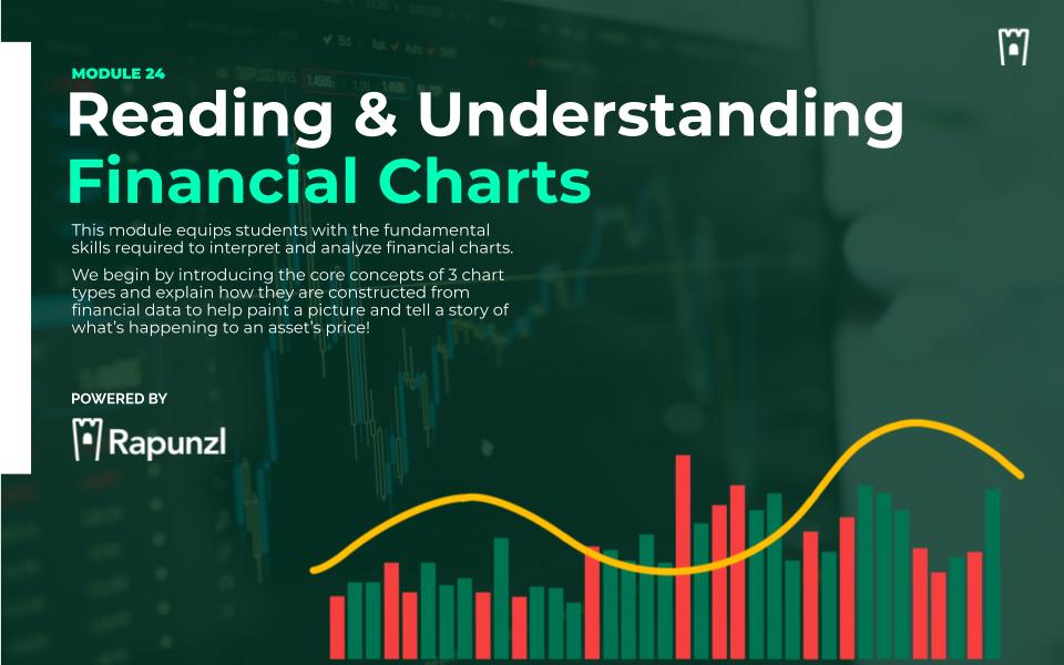
Reading Financial Charts cover graphic for the Rapunzl personal finance curriculum
Module 24

Reading Financial Charts

This module equips students with the fundamental skills required to interpret and analyze financial charts. We begin by introducing the core concepts of 3 chart types - line, candlestick, and OHLC - and explain how they are constructed from financial data.
We then delve into the interpretation of these charts, teaching students to discern trends, patterns, and key indicators that are vital in financial decision-making.

Module At A Glance

Grade Levels:
7th - 12th
Est. Length:
1-2 Hours (15 slides)
Activities:
2 Activities
Articles:
4 Articles
Languages:
English & Spanish
Curriculum Fit:
Math, Business, Economics, CTE, Social Studies
Standards Alignment:
CEE National Standards, Jump$tart National Standards & Relevant State Standards
magnifying glass with stock chart

Guiding Questions

  • What are financial charts, and why are they essential in investment decision-making?
  • How do different types of charts (line, candlestick, OHLC) present financial data, and what unique insights do they offer?
  • What is the significance of the data used in financial charts, and how does the choice of time interval affect the information displayed?
  • How do popular chart overlays like moving averages and Bollinger Bands enhance the interpretation of financial charts?
  • In what ways can understanding and analyzing charts influence investment strategies and risk management?

Enduring Understandings

  • Charts are critical in visualizing, interpreting and analyzing complex financial data.
  • Different chart types (line, candlestick, OHLC) serve varied purposes and offer unique insights.
  • The source of data and timeframes impacts the information a chart conveys, influencing investment decisions.
  • Overlays like moving averages and Bollinger Bands provide additional layers of information, helping to identify trends, volatility, and potential trading signals.
  • Reading and interpreting charts is integral to developing effective investment & risk strategies.

Module Vocab & Key Topics

Chart
A visual representation of financial data over a specific time period, used to analyze trends and patterns in markets.
Axes
In financial charts, the axes refer to the two perpendicular lines that frame the chart, with the horizontal axis typically representing time intervals, and the vertical axis representing price levels or other numerical values.
Scale
The scale on a financial chart refers to the graduated range of values used to measure the data being represented, such as price or volume; it can be linear, showing equal value intervals, or logarithmic, where each interval reflects a percentage change.
Line Chart
A type of chart that displays information as a series of data points connected by straight line segments, typically used to show trends over time.
Candlestick Chart
A chart that represents price movements within a certain time frame, showing the opening, closing, high, and low prices through a combination of a rectangular body and lines.
OHLC Chart
Stands for Open, High, Low, Close chart, a type of financial chart used to depict price movement over time, displaying the opening, high, low, and closing prices for each time period.
Volume
The amount of an asset or security that changes hands over a set period, an important indicator of the strength or weakness of a market move.
Trend
The general direction in which a market or asset's price is moving, an essential concept in technical analysis to identify potential opportunities.
Moving Average (MA)
A widely used indicator in technical analysis that helps smooth out price action by filtering out the “noise” from random price fluctuations that occur while a stock trades.
Bollinger Bands
A technical analysis tool defined by a set of lines plotted two standard deviations (positively and negatively) away from a simple moving average (SMA) of a security's price.
Relative Strength Index (RSI)
A momentum oscillator that measures the speed and change of price movements, typically used to identify overbought or oversold conditions.
Moving Average Convergence Divergence (MACD)
A trend-following momentum indicator that shows the relationship between two moving averages of a security's price.


Worked Examples

Charts In Action

Four things a price chart is really showing once you read the math behind it.

Figures current · August 2026

Percent change

Points vs Percent

%Δ = (new − old) ÷ olddivide by old

Say a stock ticks up $5. On a $20 stock that is a 25% move; on a $50 stock the same $5 is 10%, and on a $200 stock just 2.5%. The dollar change never changes — percent change divides it by the starting price, so where the price began is what makes the move feel big or small.

+25%a $5 move on a $20 stocksame $5 on $200: +2.5%

+25% on a $20 stock+25% on a $20 stock+10% on a $50 stock+10% on a $50 stock+2.5% on a $200 stock+2.5% on a $200 stock

A given point move is a larger percentage of a small price than of a large one, because percent change divides by where the price started.

Moving average

Smoothing the Noise

MA = mean of the last k closesk = 3 days

Say a stock's ten daily closes zig-zag from $96 to $124 while the trend drifts upward. A 3-day moving average replaces each close with the mean of it and the two before it, so one spike gets diluted by two ordinary days — the averaged line follows the same trend but wobbles far less than the raw price.

28 → 17peak-to-trough, price then 3-day averagesame ten closes

day 1day 10$96$1243-day average

A moving average trades responsiveness for a clearer trend — the more closes each point averages, the smoother the line and the later it turns.

Volatility

How Wide the Swings Run

daily range = high − lowone day's bar

Say a stock's daily returns across a week land at −2%, −1%, 0, +1%, +2% and +3%. Each day the high-minus-low bar is a small range; stack a week of them and the returns scatter around a 0.5% average. How far they spread — not which way they lean — is what volatility measures.

±1.7 ptsspread of daily returnsaverage drift: +0.5%

±1.7 pts-2%mean 0.5%3%

Volatility is the width of the scatter, not its direction — a wide spread around a nearly flat average is still a volatile stock.

Log scale

Why Long-Term Charts Bend

equal % move → equal log stepsame ratio → same width

Say an index starts at $10 and multiplies tenfold each decade: $10, then $100, then $1,000, then $10,000 across forty years. In dollars the last jump dwarfs the first, but each one is the same ×10 — a log axis gives every tenfold step the same width.

×1,000$10 grows to $10,000three equal ×10 steps

10¹10²10³10⁴$10$100$1,000$10,000

On a log axis equal percentage moves look equal, so a tenfold gain spans the same width from $10 as from $1,000 — the honest view of long-run growth.

Illustrative price series, invented to demonstrate each chart-reading technique. Reviewed August 2026.